Thursday 2 May 2013

Final Outcome

Dan Hodgson

Below is our completed animation for Dream Green Smoothies. As you can see, we have developed on the  simplistic line idea and storyboard motif mentioned before. Over the course of the video's production, various adaptations have been made. Most notably, the finished piece includes a new, more subdued stop-motion background to the one used initially. I also recorded a piece of backing music to accompany the visuals, performed on a ukulele with a light, upbeat tone to add a warm, tropical feel. Adding background music helped tie the piece together considerably; bridging gaps between speech in the voice-over, which was kindly contributed by Patrick Seymour, an artist from Newgrounds (http://seymour.newgrounds.com/). Below the finished piece I have posted two renders from the production stage, these help to explain the creative decisions described above; showing how the video looked with the original stop-motion background, how the voice over sounded without musical accompaniment etc.


Above: Finished Advert for Dream Green Smoothies


Above: Dream Green Advert Before Music was Applied


Above: Animation Test Based on Storyboard from Earlier Post

Tuesday 16 April 2013

Market Research

Soraiya Gihawi
We set out to explore the marketing and audience appeal of current health magazines. By examining and comparing two, this enables us to have a much clearer idea of how to appeal to the health audience of which we aim to relate to. I created a collage from both magazines to fully compare and contrast features of both in detail. Elements being compared consisted of colour palette, image content and imagery, use of language i.e. syntax, lexis, phonetics, semantics, and grammar. From looking at this, we had a developed understanding of what appeals to what audience.

The two health magazines we compared advertising and content with were ‘Men’s Fitness’ and ‘Weight Watchers’.
Weight Watchers

Men's Fitness


Initially, we decided on the target audience of each, though it being a stereotype, it was decided ‘Men’s Fitness’ was aimed at 20+ males aiming to gain healthy and fit bodies, where as ‘Weight Watchers’ was aimed at 25+ females seeking to lose weight and gain happiness.

The two contrasts in largely, however have a few similarities.


MEN’S FITNESS;
What they used –
-       Plosive phonemes.
-       Imperatives.
-       Bullet pointing for impact.
-       Images of muscular men.
-       Technical vocabulary choices (predicting the readers already have a small understanding of the topic).
-       Imagery of war and violence.
-       Semantic fields of violence and pain ‘Power’, ‘Survival’, ‘Achieve’.
-       Facial expressions including serious/ determination/ pain.
-       Nature ‘Great Outdoors’.

WEIGHT WATCHERS;
What they used –
-       Phonetically soft
-       Floral imagery
-       Happy and healthy – ‘real’ women
-       Bright and colourful; yellows, pinks, reds e.t.c.
-       Repetition of personal pronouns ‘You’ (also emphasized by syntactical placing).
-       Semantic field of indulgence and care e.g. ‘hope’, ‘loving’, ‘luxury’.
-       Nature/nurture.
-       Happy facial expressions, smiles.

The two had various similarities, though in some cases portrayed in very different ways.

BOTH;
-       Imagery of nature.
-       Aesthetically pleasing food dishes.
-       Images of people working out.
-       Technical language but neither lexically dense.
-       No/lack of cartooned images
-       Appeal to audience with connecting stereotypical interests

In conclusion, this task gave us an idea of a middle grounding of both relating to men and women who are interested in health.

Tuesday 19 March 2013

Grace Parker

Logo Ideas - Back to Basics

The project is very open to any kind of design or how the information is put across, whether it be animations, leaflets or bottle designs etc. I decided to look into logos and what could work well to show the organic nature of the clients product.
This was difficult in some ways as we have such a blank canvas that its difficult to find a start.
Rather than to look at the ingrediants or what feeling the client wants to put across by his advertisemnts i thought about what could portray the natural, organic nature of the product.


These were simply drawn and coloured in my sketchbook which i then added different effects over the top in photoshop to make it appear more professional. The soft pencil gives it that extra effect and shows a "natural looking"  symbol.

I looked into the competeistion of other busimnesses that used simplicity in their advertisements. Few of them used some kind of character or logo to help people to remember their product.
For example


Gaviscon use a 3d character to present their product, i felt tghis was relevant to our work as we have an idea for a "smoothie man" in which he is made out of the smoothie as is the gaviscon character

Innocent smoothies are another good example for what we wanted to create. This was a big inspiration for the process of our work. they also use stop animation and keep everything simple and natural. Our clients biggest competitor. However these smoothies are more for children, as the designs have different sketches over the top to show a different personality.

Yakult advertisements are brilliantly done, very simple yet incredible striking and to the point, which is exactly how we want our work to come through to the veiwer. They use the actual bottle and give it character by bringing it to life. One simple idea that looks great on screen.

After looking at these examples i started work on our "smoothie man" to see how it would turn out.

Here are a few clips i created of our smoothie man

Sunday 17 March 2013

Elliot Train: Storyboard to alternative

whilst we came to conclusion that our production would be using the minimalism approach. we all decided that our initial idea would be used as a back-up. For this, i devised an alternative storyboard to the one Dan Hodgson posted previously.


some of the main influences used for this piece would be the more cartoon styled pieces from the early 00's such as the "fruit winders" advert or "Frubes". mentioned before, the bizarre themes used in those adverts can be used to gain a wider audience.


hopefully these ideas may shed some thought into the group and help us advance with our work, if any critical inputs need to be said, don't hesitate to say otherwise.

Elliot Train.

Tuesday 12 March 2013


Adam Grubb

One of our main ideas for the Integrated Project involved fruit and veg working hard at the gym while be trained, shouted at and pushed by a fitness instructor through a screen. We were planning on using real models for this, such as clay or Plasticine, this idea mainly came from the popular personalised cards 'Violent Veg'.
From this I decided to try and make my own version of this but instead through 3Ds max to experiment with different methods for our film. I was quite happy how they turned out, with the eyes and mouths looking very similar to the violent veg look. However I would have liked to spend more time on the lime texture to make it look more realistic.


From the feedback of , we decided to revert to our line idea which is very similar to the direct line advert. With the lines traveling across the screen and forming the outline of the picture. In our storyboard we show the fruit dropping into bottles with the flavors of the smoothies appearing after. We could either simply use 2D bottles or 3D, so for experimentation, I again used 3Ds max to create some different shaped bottles. I am reasonably happy how they turned out. I struggled to create a clear plastic material for the bottles, but the glass texture I used instead for good enough for an example. My first bottle is the similar shape to the original Coca Cola bottle, and the smaller wider bottle, I got the idea from the Oasis bottle. Finally the smallest size bottle I was aiming for a more sporty look, such as the brand Lucozade.


Saturday 9 March 2013

Storyboard for Line Idea

Dan Hodgson

Below is a storyboard for the 'Simple Line Animation' concept mentioned earlier on in this blog. This is currently our primary concept as we feel the simplicity of the visuals combined with the motif of organic growth conveys Dream Green's ethos of using only natural ingredients. We are still maintaining work on a secondary idea - a surreal piece featuring personified fruit attempting to get healthy in the gym (Dream Green's target demographic being gym goers) with disastrous consequences. This alternate idea's zany and absurd humor would appeal more to the viral market, whereas the line idea is very much based on current trends in television advertising for similar products, most notably Innocent Smoothies.

The storyboard below follows the same design principle of the example I posted earlier, in that a similar paper overlay will be used as a background - although I intend to make the overlay for the finished piece much more subdued in terms of how much the image flickers - and the animation will still be hand drawn with live action images of fruit composited over the top. I have attempted to keep staging here relatively static in order to imbue the piece with a feeling of calm, reflecting the benefits of supplementing a workout with a Dream Green smoothie, hence a lot of central positioning with minimal panning and camera movement. I also considered potential sound effects here, however these will only be added to augment the voice over, which is yet to be recorded. As such it is difficult to say at this stage if certain sound effects will help or hinder the solidarity of the piece, it will become apparent during the final render whether or not sound effects need to be vetoed.

By the time of the client's next visit, this piece should be fully animated with a preliminary voice over script and we will also have a 'Fruit at the Gym' storyboard to present in order to receive feedback regarding any alterations which may be required as well as to gauge the client's response to both ideas to ensure we take forward the most promising concept. Following this we will be able to finalise any design ideas and record a voice over track.

Click Here to View Full Size Image

Wednesday 27 February 2013

Grace Parker Character Design (Smoothie man/Spinach)

Grace Parker Character Designs.

We discussed towards the beginning of this project about creating some kind of smoothie man character (mascot) and when the client said he liked the idea of this we decided to pursue and start on a small animation to introduce the smoothie.


 I imagined him to strut across the screen and leave behind him bits of the smoothie that will form into Dream Green


Inspired by the Frubes advert and the Cheese String advert this is what i came up with..


I also did some designs for the spinach and how I imagined it to look. At first i could see it dragging itself across the floor, then I did a more "jabba the hutt" look, which I also liked. I wanted it to give the effect of its face almost drooping down its body, yet keep it friendly looking and appealing.


Sunday 17 February 2013

'Fruit at the Gym' Animatic

Dan Hodgson

Below is an animatic for the idea of 'Fruit in the Gym' mentioned in previous posts. The purpose of this is to provide a general idea of: how long the piece would be; the way in which the the idea flows as a whole; readability of primary concepts such as the health benefits of Dream Green smoothies; how effectively the piece engages with the intended clientele - primarily gym goers.


The animatic was produced in a fairly basic cartoon style with minimal attention to backgrounds and props in order to allow an objective decision to be made as to whether or not key elements (narrative, timing, scene layout etc.) work together in such a way that key information can be conveyed while still engaging with the audience. As discussed previously, the completed animation could be produced in a range of styles including stop-motion and CGI. My major concern with this idea is that its playful and light-heated style may appeal mainly to teenagers and younger viewers, in contrast to Dream Green's intended age range of 25-40. However a great deal of very popular advertising campaigns have used a similarly unusual and zany concept to reach a more mature audience:


The advert above is also an excellent example of how animation can be composited over live-action in such a context - we discussed a similar technique whereby the fruit would be animated separately before being composited over a live-action gym instructor. Another potential area of weakness attached to this idea is the time-span of the piece. Adverts for television generally don't run over 40 seconds due to the cost of air time and that maintaining audience attention for any longer becomes difficult. As such the idea should either be compressed to a shorter time-span, or taken forward as a piece for online advertising through sites such as YouTube or Vimeo.

In all, I feel the idea has a lot of potential - it's concise, informal, conveys key information in an engaging manner and loosely targets the intended audience in a way which is not as potentially exclusive as explicitly focusing on one demographic. Though the weaknesses of time-span and age appeal of this idea seem fairly inconsequential, when it comes to the final decision of which idea to take forward, these factors could lead to one idea being chosen over the other.

Sunday 10 February 2013

Initial Ideas and Rough Sketches for 'Dream Green Smoothies'

Dan Hodgson

Our initial brainstorming sessions took place prior to meeting with the client, as such these early ideas were only loosely connected to the product. While this gave us the freedom to run with any thoughts that came to mind, ideas were limited in terms of not being aware of information such as target audience and cost etc.
From our meeting with the client, my interpretation of what we should be aiming for is something which: is not too formal; explains the product's effect on health (particularly digestion); appeals to the sports market; and highlights the organic nature of the product. In this post I've included some of my basic sketches from our brainstorming sessions, along with some more refined concepts for two ideas which we feel could be taken forward.

Rough Initial Storyboard
Simple Line Animation

This idea uses minimalism to convey the use of pure, natural ingredients in Dream Green's smoothies. We have discussed several possibilities as to how this style could be applied to a narrative. For example, as the line is being drawn across the screen, a voice over might summarise the general ethos of Dream Green, before going on to list the ingredients of a particular smoothie - which would emerge from the line when mentioned, as in the example below. A second line may then appear forming a cup, into which the ingredients merge before popping to reveal a photo of a real Dream Green smoothie, similarly to the way the apple pops into the video. For the video below I used Flash to animate the line, composited over stop-motion paper in After Effects, as this was simply the fastest method. However we came up with several ways this could be executed including the use of a whiteboard to animate the line through stopmotion and using claymation for text. The use of a voice over which only needs to be loosely synced to footage allows any information to be conveyed without necessarily having to produce accompanying visuals, however too much voice over could lead to a result which is less dynamic than having a fully animated narrative.


Rough Initial Sketch
Fruit at the Gym

This idea is more focused on the target audience than the previous idea,  however the style is informal enough to still appeal to a relatively broad demographic. The scenario immediately establishes a relationship between Dream Green smoothies and sport/exercise; concisely summarising the principle that these drinks are designed to help you stay healthy. A voice over would still be used to convey more detailed product information, although this time through the medium of a ruthless gym instructor barking orders at fruit, explaining why it's important to stay healthy for example. The sketch on the left shows how the general scene would be set, with various fruits and vegetables - all of which would be ingredients of a smoothie - working out on a kitchen counter while the instructor peers over. Eventually the fruit would begin to fly off gym equipment and break themselves up to the point that they all get squashed together - at which point the instructor tastes the resulting smoothie, commenting on it's deliciousness. We discussed the concept of using stop motion animation incorporating real fruit as puppets, however this could turn out to be too similar to the 'Violent Veg' series of greetings cards. Below is a piece of concept art I produced for this idea, giving a more detailed insight as to how I picture this idea.


Saturday 9 February 2013

Grace Parker

Grace Parker

Dream Green Drinks

Ideas we had on our first day 29/1/13

Smooth Man (i had an idea of him being a human like yogurt type look)
Michael Jackson Smooth Criminal song
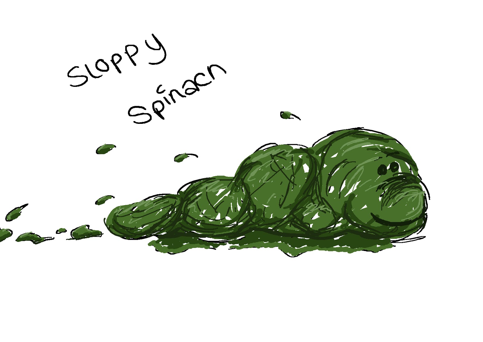
Antibodies fighting, and smoothie helping them, a battle field in the body type thing

Questions to the client 
Group meeting 1/2/13

  • Target Audience
  • Formal or Informal
  • Expectations
  • Background info on Client
  • Selections of Products
  • Flavours
  • Cost
  • Design (Logo or slogan)
  • Overall Appearance
  • Availability worldwide or local
  • How does it differ
  • Contact info


Qs and As for Client 5/2/13
I'm an Idealist

From the questions the class asked

To start off with he had an ill family member, so he looked into healthy organic drinks to improve their health, and he found it worked very well.
His ingredients are all organic, nothing added to preserve. Rather than sugars he uses greens and herbs.

  • Ginger
  • Lemon
  • Banana
  • Melon
  • Mango
  • Cucumber
  • Celery
  • Grape

Hes been working on his product for 2 years.
His target audience are people aged between 25-40 and is going to be distributing his product in gymnasiums and sport markets. Its aimed towards people with poor eating habits and people that want a more healthier DIGESTION.
He is open to any style and likes the idea for it to be lighthearted and have humour, so long as it is still informative.
He likes the idea of short snappy clips of animations, and is open to all media types.

Starting Points

  • Digestion
  • Nutrition 
  • Organic
  • Natural


Initial Ideas 7/2/13 (Adam joined our group)
A seed being planted, growing into a tree then things coming off of the branches.
Lines morphing into objects like the direct line advert
I liked the idea of something that flows easily like the Robinsons squash advert where splashes of colour dance around the screen.

My ideas 

  • Colourful
  • Simple
  • Movement
  • Emotive
  • Informative
  • "Poorly" digestive system
  • Create a character
  • Some way to show variety of flavours


Fruits being splattered on screen, then all coming together  and dancing around the screen to tango music. Then going into a bottle and becoming the smoothie.

Different fruits gradually coming together (plum rolls onto screen looks around then a grape rolls on and they interact) reactions from the fruits, they all become friends, dancing and jumping around celebrating. the all suddenly get squashed, cuts to silence and put into a bottle. (Possibly some butch man saying something along the lines of "Nevermind them lot! Sort ya GUT out!")

Another idea i had was a big gym instructor making all the fruit work out in a gym, pushing them to their limits.

Spill from a smoothie bottle making mess on table, then faces form in the smoothie trying to tempt people to drink it.

Skeleton made of claymation, pulling faces when looking through the body. (Operation Board Game) smoothie helping the body and digestive system.

Group Meeting 8/2/13 
Myself Dan and Elliot briefly met after class to go through ideas.

Idea 1
We all liked the gym instructor making fruit workout, this idea grew to a miniature gym for the fruit, the gym instructor sneaking up behind and shouting etc. fruit flying off of treadmill and other equipment, splattering onto the instructor him licking his face tasting a "revolution" of flavours, combined by the perhaps bizarre creations by the fruit? But showing that it is good and it does work and taste great.

Materials

  • 3D model for gym instructor
  • Set- Paper? Flash? cut out objects? (Terry Gilligan Monty Python)
  • Opening scene claymation 
  • We liked the idea of a mixture of styles


Idea 2
Line appears on the screen and forms a shape, for example an apple, then suddenly it pops into an actual apple, then the line comes off the apple and goes into something else then again pops into the actual object.

Materials

  • White boards
  • Flash paper background
  • Scrunching of paper for opening scene (opening and closing)

We agreed to work on these ideas for next week and think of others for back up.

This could be something to look into!

http://www.youtube.com/watch?v=sja8OTnMYxs


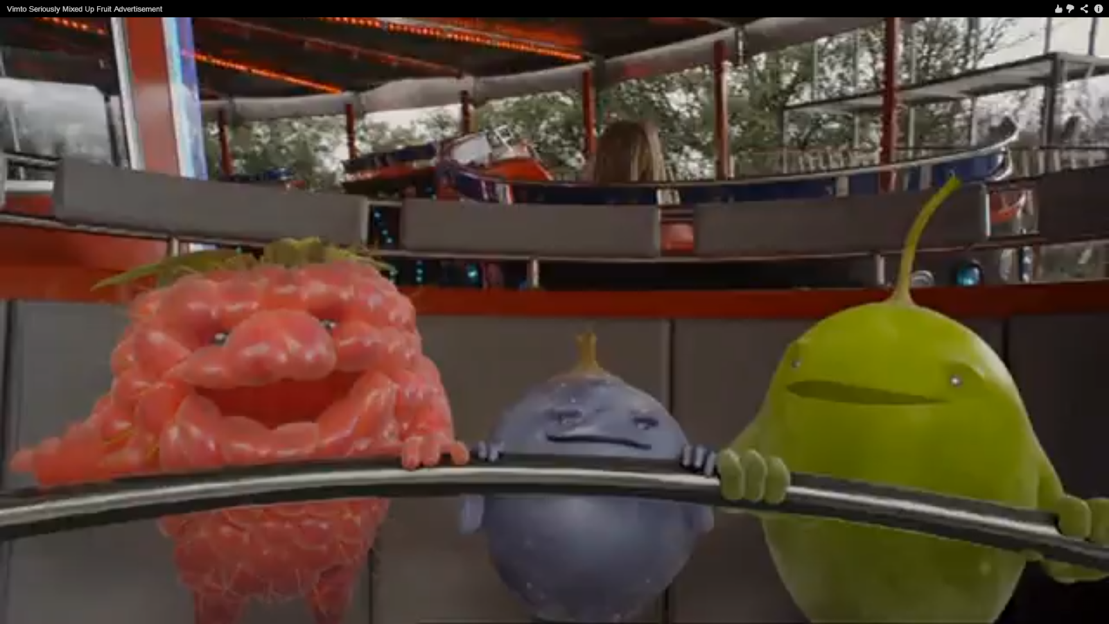
Another Advert I love
http://www.youtube.com/watch?v=MJ8AFpCV60g


I found this one, which i though aniamation was quite good
http://www.youtube.com/watch?v=2u_BUV91TLg


This was voted best advert in 2010 
http://www.youtube.com/watch?v=6tCtM8UEQv8